Your brand website (probably) sucks! This is part 1 of the promised follow up to the Velo Apartments brand changes we made.
We think our old website sucked. I can say that because I made most of it. Okay, it wasn’t an awful website, especially when you compare it to some 90s style atrocities you can still find. However, when we started Velo Apartments, we needed something that “did the job”. What we had beforehand took only a couple of days to make and it worked. We showed the information and had the colour scheme we wanted. It had a decent photo gallery. It was responsive and worked on any device.
What it certainly wasn’t was perfect. Those imperfections added up. Our colour scheme wasn’t eye-catching and we had some layout choices that broke the flow of the page.
It’s possible that your brand website suffers from these sorts of issues, or other common website design mistakes. I’ll cover both what we learned and some more general guidance.
“Can’t I just use WordPress or something similar?”. Sure you can. If you’re pressed for time or cash that might be the best thing for you to do. However, sometimes your requirements are quite specific or you want something lighter, so custom may be the way to go.
“But wait, I don’t know anything about web design, can I get an agency to do it?” Yes, please do, unless you have modern web design experience. This post is intended for non-technical brand owners, so you can make sure you know what to look out for from whoever does your website. Make sure you get your money’s worth.
Mistake 1 – No mobile design
This shouldn’t even be necessary to write these days, but it’s still too common to see agencies who charge top dollar for website packages and don’t know how to make responsive websites properly. Making 2 separate versions of the website, one for desktop and one for mobile, in a “/mobile” folder or “m.” subdomain won’t cut it. That’s twice the work and half as good as other alternatives. You’ll always end up with a screen size where something just isn’t right.
There’s no excuse. Use a simple responsive framework like Bootstrap which allows you to simply layout content in a grid system. With some care and attention, you can make even complex elements reflow to look acceptable on any screen size. All images should also resize sensibly since you don’t want images exceeding the screen width, nor do you want them being upscaled and looking low quality or taking up excessive space.
Thankfully, we never made this mistake and you should make sure you don’t either.
Mistake 2 – Loading the universe
I’ll admit, I wasn’t quite as careful as I could have been when making the original Velo website. We were loading JavaScript that we never used or didn’t truly need. Some Bootstrap elements require JQuery, Popper.JS and Bootstrap.JS to function. That’s a lot of JavaScript to load when your website is simple and you’re using 1 element that actually requires it. These aren’t exactly large files, but they’re still extra network requests that the browser didn’t need to make which made the page load that little bit slower.
During our redesign, I ditched all the external JS and replaced about 100 lines of JQuery calls with native JavaScript. Native JS is a lot better than it used to be, so don’t slow down your page by loading external libraries for small scripts.
Mistake 3 – Unnecessary JavaScript
Unless you need complex animations, JavaScript is your enemy. Modern CSS3 gives you lots of flexibility and performs much faster. If you’re using JS animations, your site probably also suffers from Mistake 2. We ditched these in favour of CSS animations.
A small amount of JavaScript to add and remove the relevant classes from elements will trigger your CSS animations using ‘transition’. Easy.
Mistake 4 – Weird layouts
I’ve never understood why people put contact details like a phone number and email address above a top navigation bar on mobile layouts. Sure, it makes the information instantly available for visitors, but they’re often more interested in what you have to offer. The contact comes later. Also, it just looks hideous, like something went badly wrong when displaying the mobile site and content got hoisted to the top. A navigation link to contact details looks so much better.
Mistake 5 – Not compressing your content
This especially applies to images being displayed on your page. For photos, you will probably be using JPEGs and these should be compressed. There’s no hard and fast rule with how much to compress an image. It’s about striking a balance between quality and file size. You’ll probably have to go through each image individually and compress it as much as you can before it is visually “off” at the size you want to use it. For a 500 pixel width image, you don’t want a file size of more than 50KB most of the time. Some JPEGs you’ll be able to set the quality to 85 and it will still look okay. 90 tends to give a decent balance.
Using sensibly sized assets is important. Your browser can take a 5000 pixel width image and downscale it to 500 pixel width. However, you’re unnecessarily slowing down your page load if you need to download an image that large and only ever use it at a much smaller size. You also don’t want the browser to slowly load chunks at a time. It looks ugly. Use lazy loading if you need to load large images.
You can also use more modern image formats such as JPEG 2000, JPEG XR, and WebP. These can give better compression results while maintaining quality but not all browsers support them so you’ll end up needing JavaScript to detect your browser (version) and pick the best available image. It may not be worth it.
Mistake 6 – Not using caching
Caching means your browser stores stuff it has already loaded before so you don’t need to download it again. It greatly speeds up page loads after someone visits your site once. You can get away with caching most assets for at least 1 month for static websites.
The downside is that if you change an asset, your visitors’ browsers will probably still have the old version. Get your developer to add versioning to your URLs for anything you are likely to change and might break your site for people who have old versions.
Mistake 7 – Not using progressive design principles
This is strongly linked to Mistake 3 with unnecessary JavaScript. Since most browsers support JavaScript by default, this isn’t much of a problem nowadays. However, some enterprise networks still block it for security purposes. If a lack of JavaScript completely breaks your simple brand website, you’re going to have a bad day. To be clear, I’m not talking about web apps here. There is often no way to build a web app without relying on JavaScript, but if your website is mostly static information, why not make it usable for more security-conscious folk.
Key functionality
The new Velo website lets you view our properties on the homepage. You can also search and navigate between pages of results. When you have JavaScript enabled, all this functionality happens without the page reloading. We have some nice animations and it looks smooth and sleek. If you don’t have JavaScript enabled, you can still view, search and navigate through our properties. The experience isn’t as good since the page has to reload but at least the page isn’t broken and missing the core content we want our visitors to see. For us, this was a small and simple change which was well worth implementing. That isn’t to say everything works correctly. Our contact form won’t work without JavaScript since it requires reCAPTCHA. That’s a more acceptable trade-off than our key information being unavailable.
Animations again
A lot of our new animations start with hidden elements, before we use JS to add a CSS class to trigger an animation as you scroll down. Obviously, if you don’t have JavaScript enabled, those classes never get added so elements remain hidden, right? We fix this by making all elements visible by default, then adding an additional class when JS is enabled. This means that off-screen elements only become invisible once our script has loaded. This makes sure the content will always be visible, even if the animations can’t work.
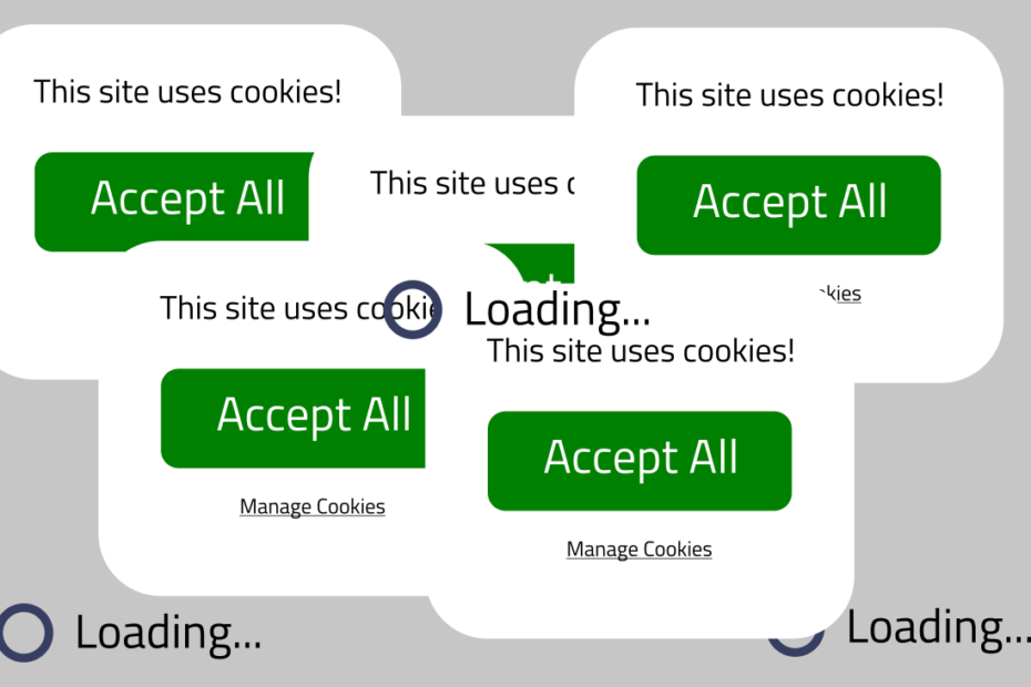
Mistake 8 – Cookies and privacy
GDPR means you need consent to do stuff with personal data. You also need a privacy policy. We like to use Google Analytics and other tracking services to find out how well our site is performing. That needs to be clear in your privacy policy and you need to allow users to manage cookies. We use Google Tag Manager to detect when the user has requested we don’t use Google Analytics on them. This tells Google to not set any cookies on our site for that visitor.
Cookie Warnings
We all loathe them to be honest but they are an important part of consent. You should give visitors the ability to access a way to manage cookies through your warning. However, don’t make these obnoxious. Popups are generally bad. Web design moved away from auto-playing videos with loud audio and ads that pull your focus. For some reason people are making the same mistakes with cookie warnings. An overlay appearing on top of the page with a popup is annoying. What’s worse is they’re usually JS triggered so they appear a couple of seconds after the visitor has already started reading the content. You’ve just pulled their focus which is terrible user experience. You make social engineering attacks by malicious parties easier when you help train your visitors to click the first button they see to dismiss the annoying box.
Make choosing which cookies to enable and disable easy. Keep text short and don’t overload the visitor with information. If you run ads with 100s of cookies from different advertisers, give the user an option to disable them all at once. Many websites obfuscate warnings with dozens of options or double negatives to make disabling things harder. Don’t do that, it’s impolite. Most of all, follow the KISS principle: Keep It Simple, Stupid. You should fulfil your ethical/legal obligations without making the user jump through hoops.
Mistake 9 – Design and colours
Use colour theory to pick colours that go together and make sure everything is clearly visible. Ensure your foreground and background colours meet contrast standards so that text is easy to read at a distance or on low brightness displays. Once you have the basics down, spend time refining your site. We went through 2 major iterations to make the new Velo site. Our first was a more modern refresh of the old design but our second was something completely new with better colours. It took around 1 month to complete since we obsessed over every detail, from corner curvature and when to use borders, to font choices and layouts on different screen sizes. That’s what you can and should do too when you move from “does the job” to “this represents our brand”.
Mistake 10 – If you go custom, do it properly
Your developer should do a good job. However, even some agencies don’t actually create HTML and instead use desktop tools such as Adobe Dreamweaver. Again, there are genuine use cases for these, but if you want something custom and perfect, building it from the ground up may be the best option. I can always tell when websites were designed with a drag-and-drop desktop tool, exported to HTML and uploaded when there’s a complete mess in the source. If you need to make changes later, requiring access to the original tools and templates that an agency used is awful. You want the flexibility of being able to ask any decent freelancer to be able to make simple changes, without needing to rebuild the whole site.
I’ve often found that these programs encourage bad practices since you can export complete individual pages. That’s great… until you decide that you want to add a link to a navigation bar and realise that you have 20 HTML files to update to make the change across every page. Why some agencies still don’t use server scripting instead of pure HTML, I don’t know. Laziness or incompetence? I’m going to avoid commenting on that one.
Conclusion
Your brand website (probably) sucks. It doesn’t have to though. With due care and attention, and help from a reputable developer, you can make your brand stand out with a visually appealing AND user-friendly website. Shop around and make sure whoever you ask for help knows their trade. Developers hate being given vague instructions or a set of assets and told to “build something”. Tell them exactly what you want or you won’t get something you are happy with.
In 2017, according to Google, “53% of people will leave a mobile page if it takes longer than 3 seconds to load.” Don’t be part of that statistic by avoiding poorly optimised content and annoying popups. You can find more page load stats here.
Previous post: 7 tech predictions for 2020-2029